360Insights, Product designer, 2018-2019
360 Virtual Rebates Dashboard
Overview
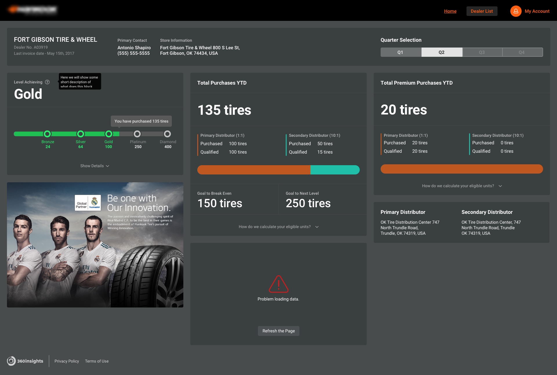
Virtual Rebates Dashboard is a service for companies selling tires with rebate options for their sales representatives. In our case, the platform already existed, but management decided to rebuild the application from scratch with new technologies and a delightful user experience.
The previous system was built on the legacy core and was very outdated. The challenge was to understand how people were using the old system, what kind of problems they are facing, and how to improve those features in the new app.
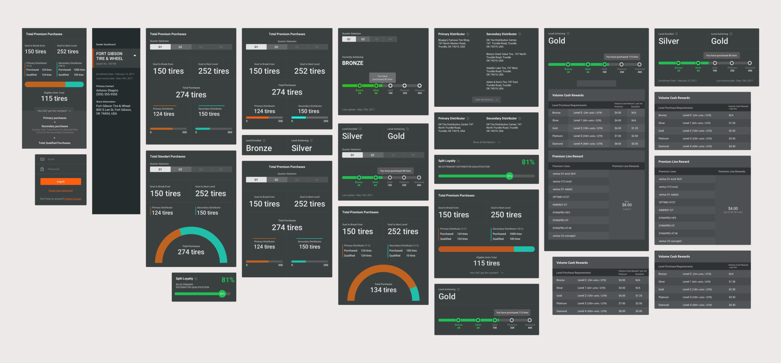
The app from scratch
Our current app was using legacy technologies, so to scale the app to other industries and deliver a more enlightening experience to different devices. We got a chance to make the new app in the most efficient way.
20+ interviews, 12+ hours of Hotjar recordings, 100+ support tickets
Before the current redesign, we had to analyze hours of recording from Hotjar; we went on-site with more than 20 district managers to see their work in action and went through 100+ feedback tickets with suggestions and comments. It was a long preparation, but it gave us tons of insights into how users work with our app, with all the pain points and struggles.
How are district managers using the app?
- We wanted to understand how we could make a new app fit every need of the manager.
- What is the essential information on the go?
- Is there any difference in conditions while using mobile versus tablet?
- Is everything clear inside the app?
- Also, we tried to see both perspectives of new users (under 30 days) and experienced people (over 60 days).
How can we make the app flexible enough?
At the moment of the redesign, this tool has been used mainly by tire companies. One of the more significant tasks was to build the app in a scalable way, so it will be able to accommodate new markets in the future.
We tried to make all blocks reusable, as well as the logic of how we approach tiers. The decision was to make "Profiles," so if a new client is coming in, we can easily set up a new profile and configure it accordingly.
Context of Use
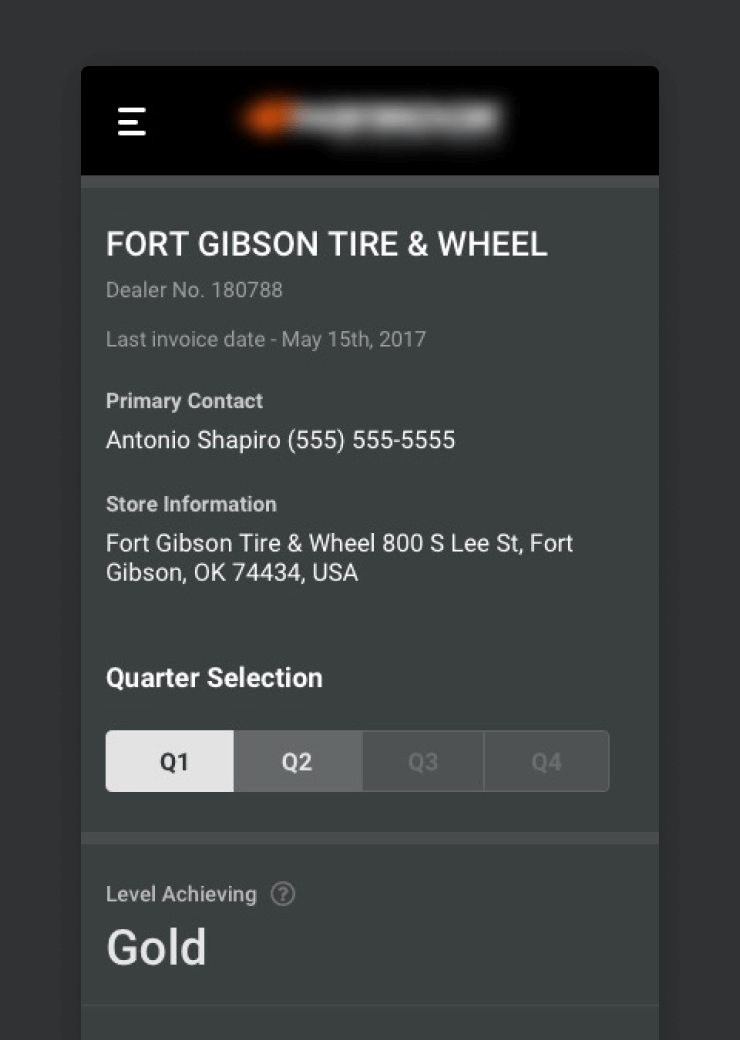
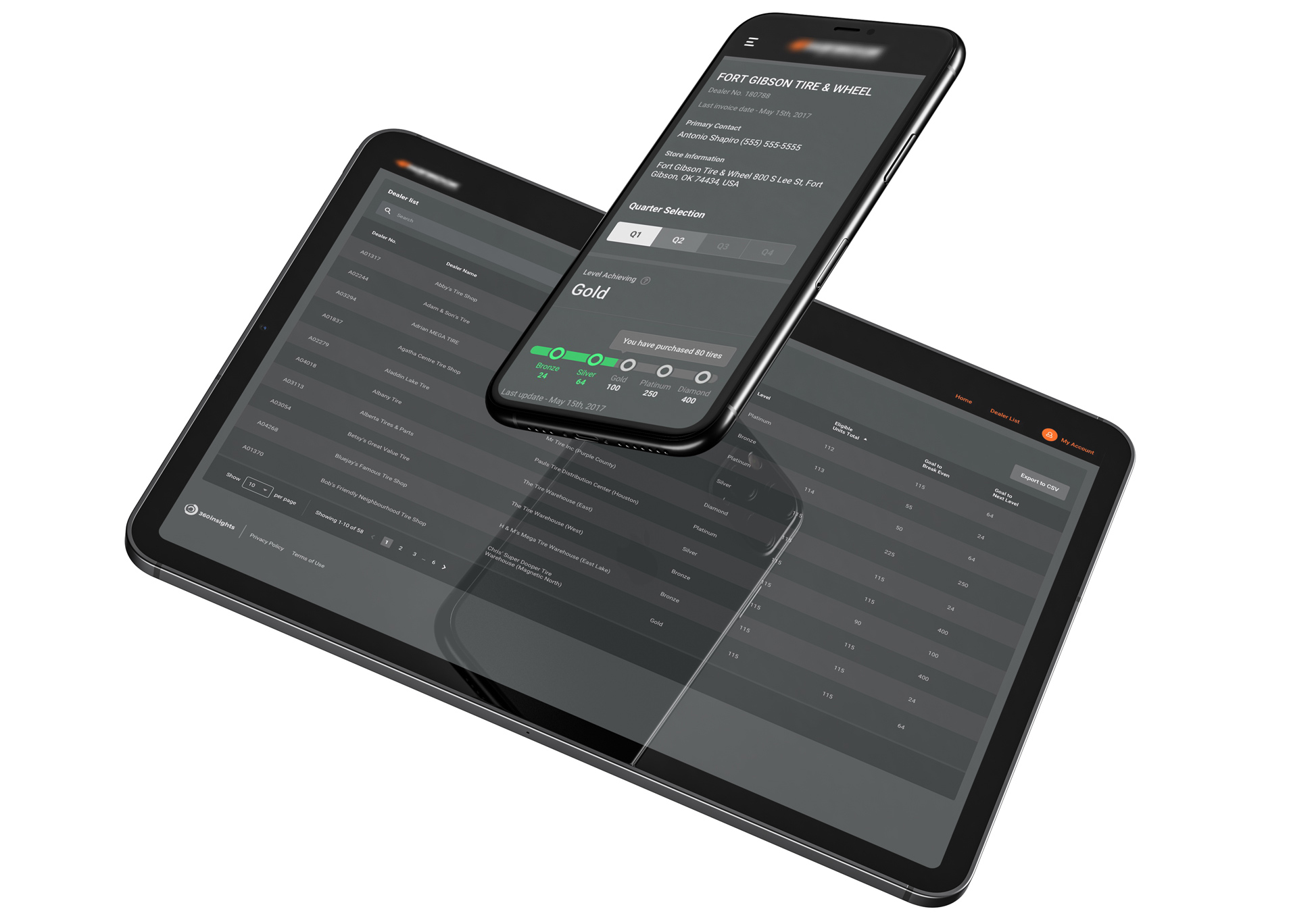
The first and most significant finding was around the context of use. Despite the fact that our old app wasn't supporting mobile and tablet versions, district managers have been continuously using them on tablets and mobile.
Device Stats
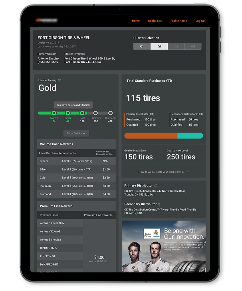
So now, the most used devices are smartphones and tablets and only then was the desktop. Managers were always on the go, so it was more convenient to check the store info and their performance from a tablet/phone and perform heavier tasks through a desktop.
Mostly used on Tablets - 35%
During the research, we discovered that the most used device is tablets. Usually, they would receive a tablet at work and use it all the time as a primary device for all work-related stuff. So we started talking to managers and trying to figure out the best possible experience.
Frequently on Smartphones - 25%
Mobile usage wasn't that high, but it's because there was no mobile version. District managers were zooming in on a desktop version on their phones because there was no other way to get information about a shop on the go. A smartphone was the only device with an internet connection.
4x faster
One of the most significant improvements was the overall speed of the app. The completely revised flow helps managers to perform their work 4x times faster. Fewer clicks, more information available on the dashboard.
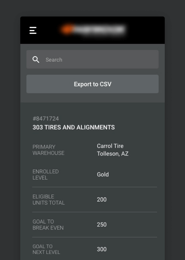
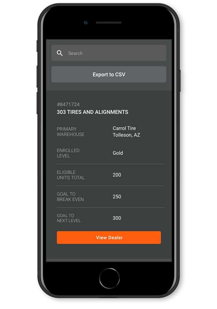
On the Go
After the redesign, sales managers can easily use the system on the go. We completely changed the tablet and mobile experience to show the essential information in a given context. Some complex features have been completely removed from the mobile experience.
Flexibility and complexity
By working on this dashboard, I got a pretty good understanding of how to handle users' attention inside complex apps properly. On a dashboard, some of the users could have up to 10 different information blocks with different levels of importance. In this kind of app, it's crucial to give some flexibility so users can arrange blocks as they need.
Average user
During this project, I've learned that even complex interfaces can be easily used by professionals who understand the terminology. It's necessary to find out your average user of the app because only in this way you can create the most delightful user interface.